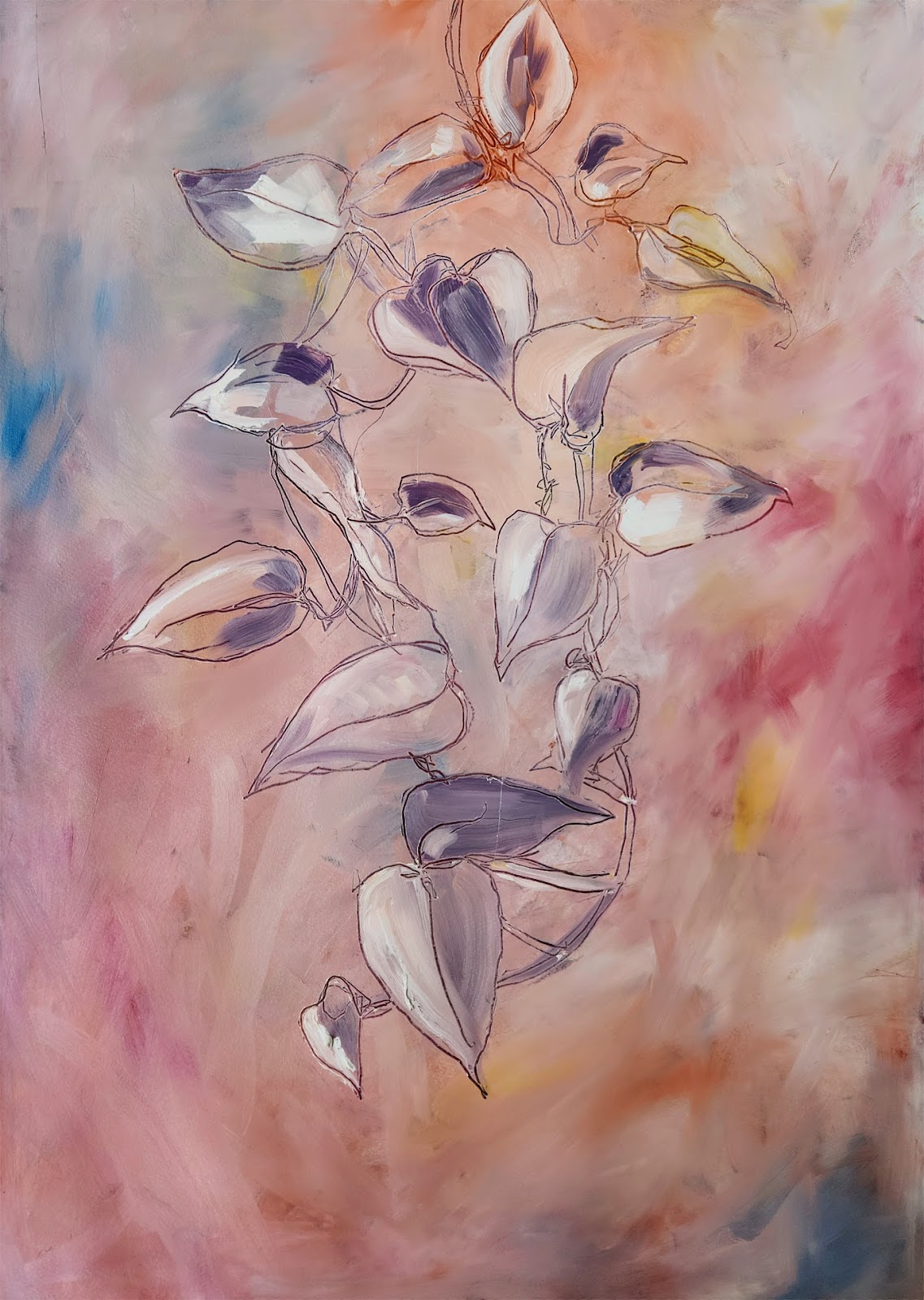
Vines by Mimobase
The publics perception of this painting of leaves with a soft pastel background
About
25 random people were asked to look at a work of art for 5 seconds then answer two very simple questions. How did this make you feel? and why did you answer that way?
Stats at a glance
Question 1.
How do you feel about this image?
Of the 25 participants, 7 were 20-24 years old, 5 late 20's, 7 in their 30s, and 6 were over 40
32% Really liked this image
36% Liked this image
8% Felt no strong feelings towards it either way
20% Did not like this image
4% Really did not like this image
Younger participants tended to favour this type, those participants over 35 started to sharply display that they disliked it.
Reviews
What was it about the image that made you give it that rating?
The participants were then asked to give reasoning for their opinion, why they liked or disliked the image, and to give context behind the score.
From those who - Really liked it
I like the blended tones and colour palette, and the circular clockwise expanding dance like movement of the leaves/petals
The colors and it looks like water color. Very relaxing picture. Neutral as well.
on a scale of 10 i will 9 because as it explains due to the climate change the leaves of a plant is fading and looking so dull and it actually represents our life
It's full of emotions
From those who - liked it
The choice of colours and the mix of colours mainly - they are light and therefore its relaxing to look at the picture
the fusion of colors, the linings
I like the background because it kinda messy but in a good way. While the plant itself need some color or details.
The colours make me feel at ease, and i think the linework is pretty.
Color Theme and there is a Human face in the image.
From those who - felt neutral
Nice colors
From those who - did not like it
it's not pleasing to my eyes, especially the lower part
It looks rough and unfinished
Confusing image - dying flower
It is too abstract and doesn't look professional or interesting
There is no proper structure for the image and the background could have been more appealing.
From those who - really did not like it
It was a dry leaves and flowers i feel
Interview

A chat with the artist, talking through the results. For full transparency, this was done as a prototype test (on my own work) to see how the results would field and to develop a test script to apply to all artists going through this process. What you are about to read below is how an interview would be conducted with a participant.
So without seeing the results just yet, how do you think your work went?
An interviewee would reply here
I'll let you know something about the demographics and how your work went.
"Recap results of participants and ratings"
An interviewee would reply here
I'm going to read you a few from those who really liked it and at any time you can tell me what you're thinking.
"I like the blended tones and colour palette, and the circular clockwise expanding dance like movement of the leaves/petals"
An interviewee would reply here
Staying in the positive, these are the replys from those who liked it at any time let me know what you're feeling.
"The colours make me feel at ease, and i think the linework is pretty."
An interviewee would reply here
These are the nuetral comments let me know what your thougths are.
"Nice colors."
An interviewee would reply here
I'm going to read you some of the did not like it responces and let me know what you're initial thoughts are
"It's not pleasing to my eyes especially the lower part"
An interviewee would reply here
Almost done, I'm now going to read results from the really did not like results.
"It was a dry leaves and flowers i feel"
An interviewee would reply here
What do you feel now having heard all that? Do you feel they get the work, are you suprised?.
An interviewee would reply here
& if you wanted to know for myself the comment in did not like "It is too abstract and doesn't look professional or interesting" stabbed my soul like a knife.
Artist details
Name Mark Payne (mimobase)
Social @mimobase
Web mimobase.com
